


Save the Children
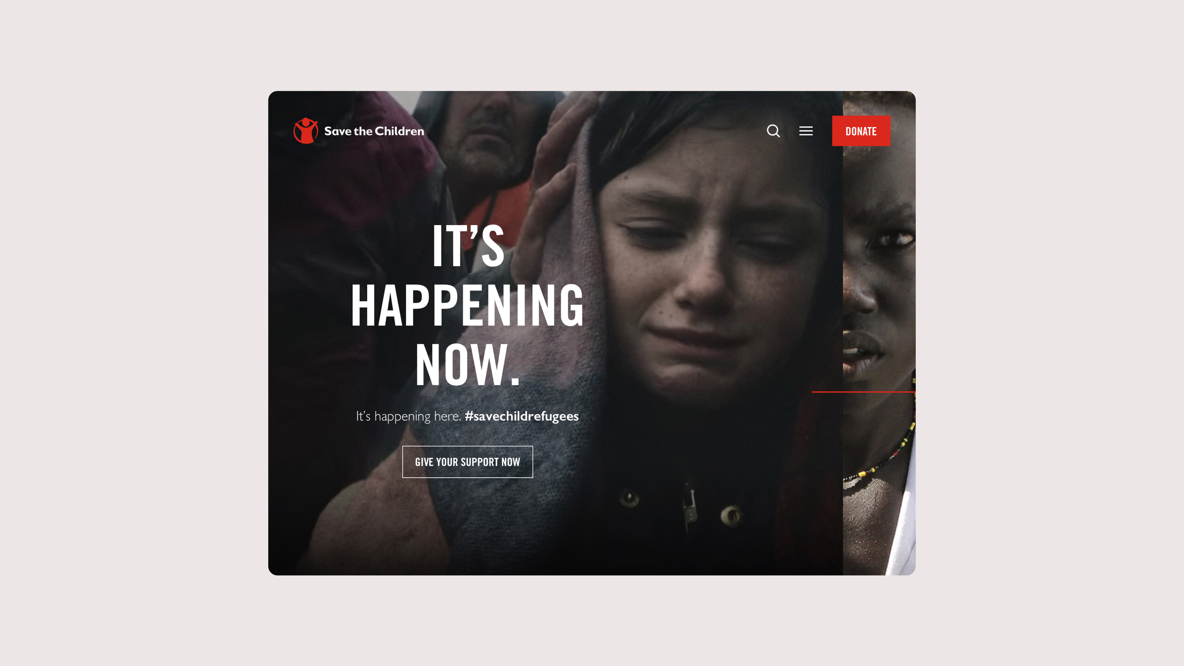
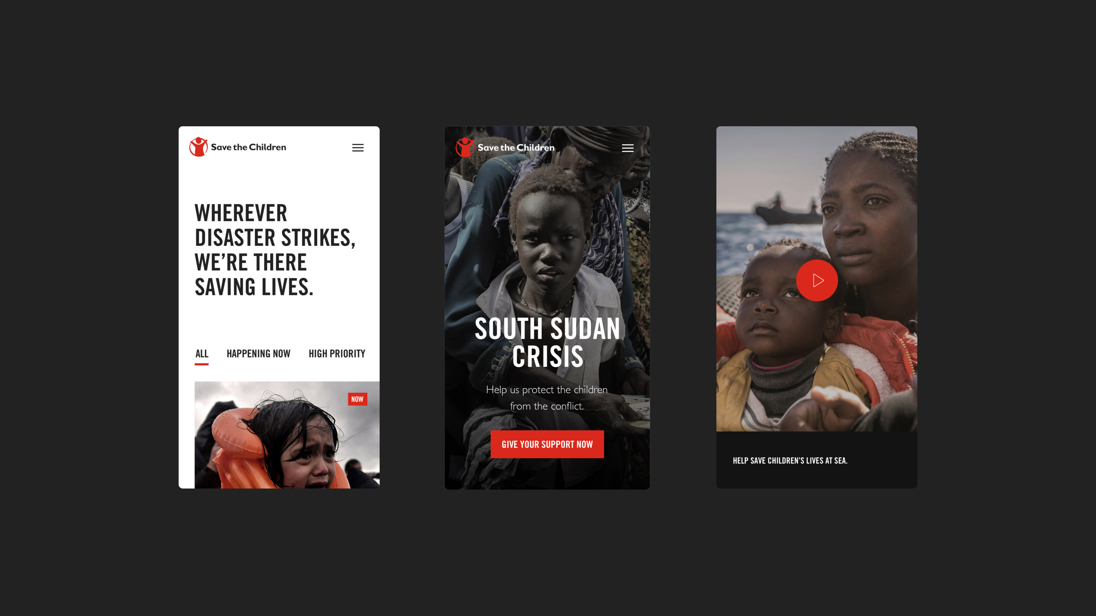
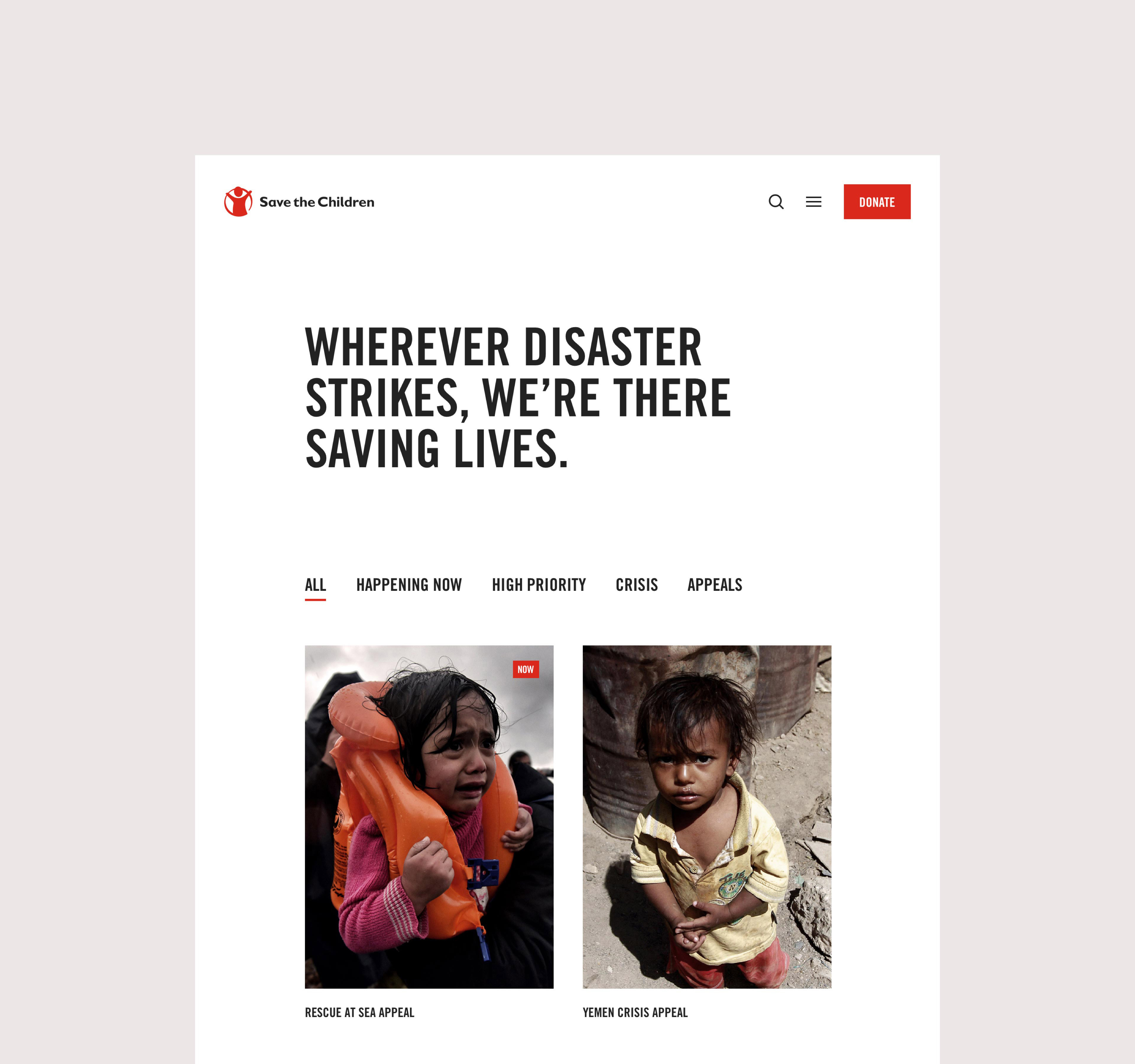
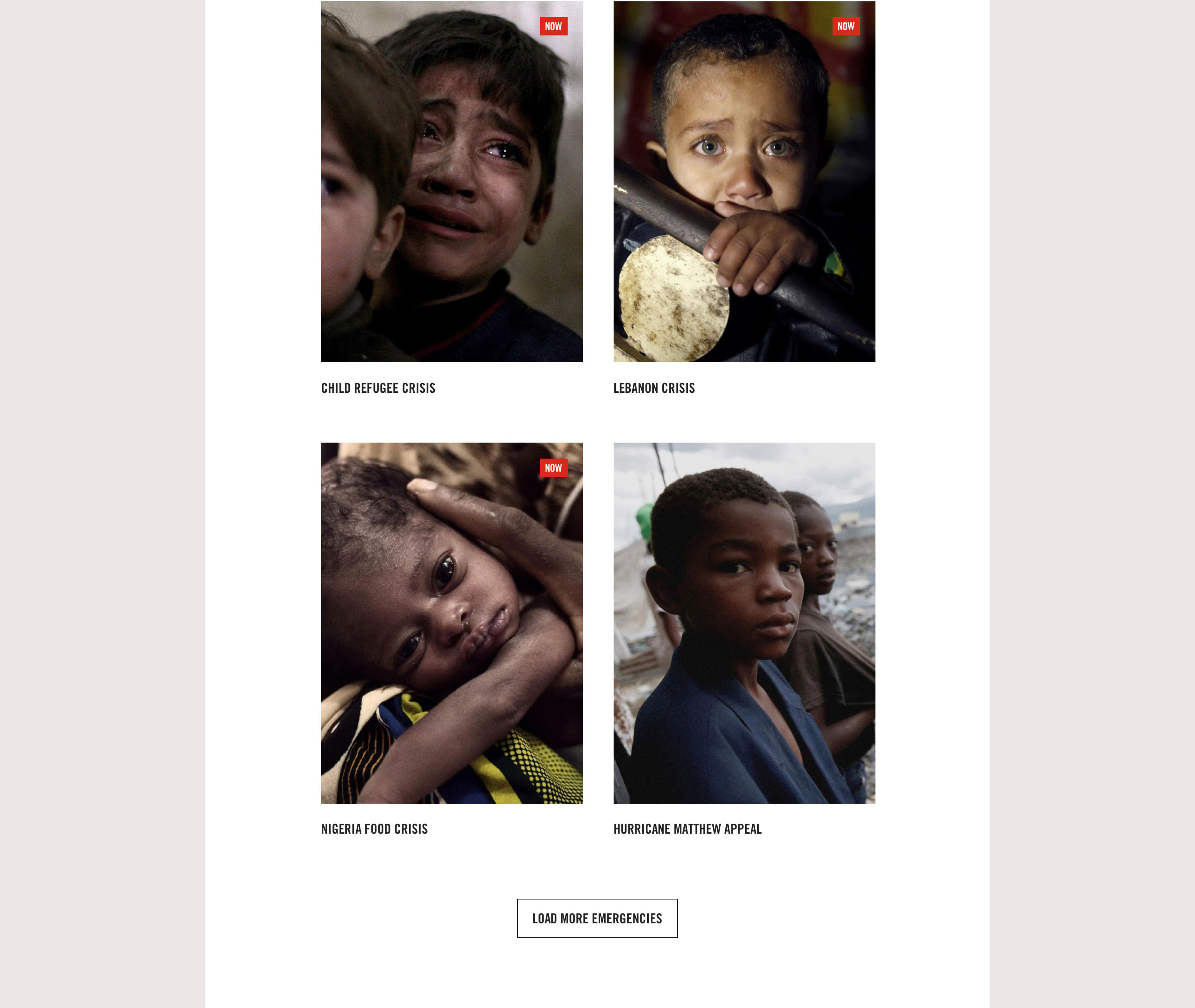
The Save the Children UK redesign aimed to align the brand's visual identity with its profound philosophy and mission. The visual design aimed to serve as a testament to the authenticity of an organization composed of pioneers and courageous individuals united by a shared commitment—to stand alongside children and safeguard their rights.
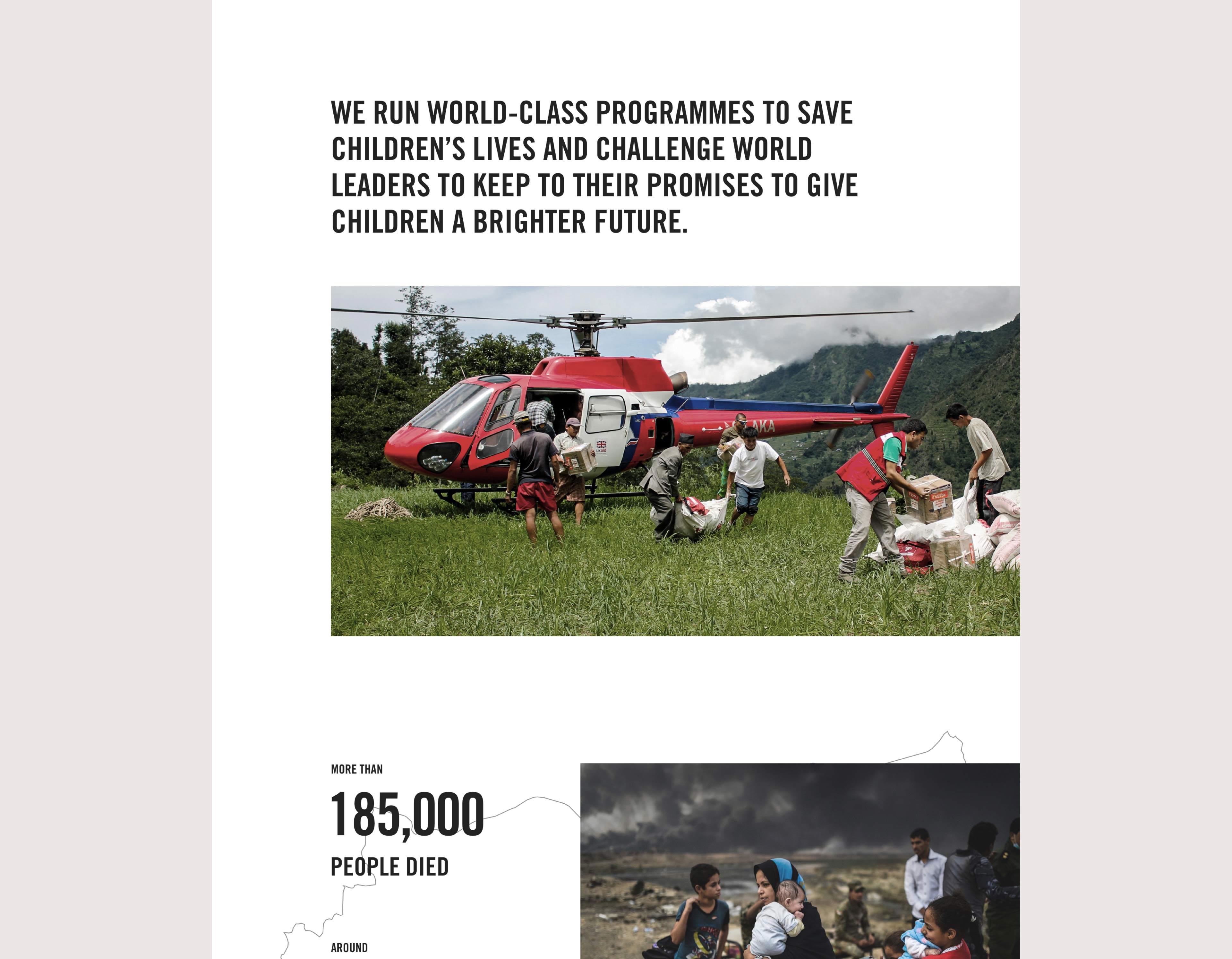
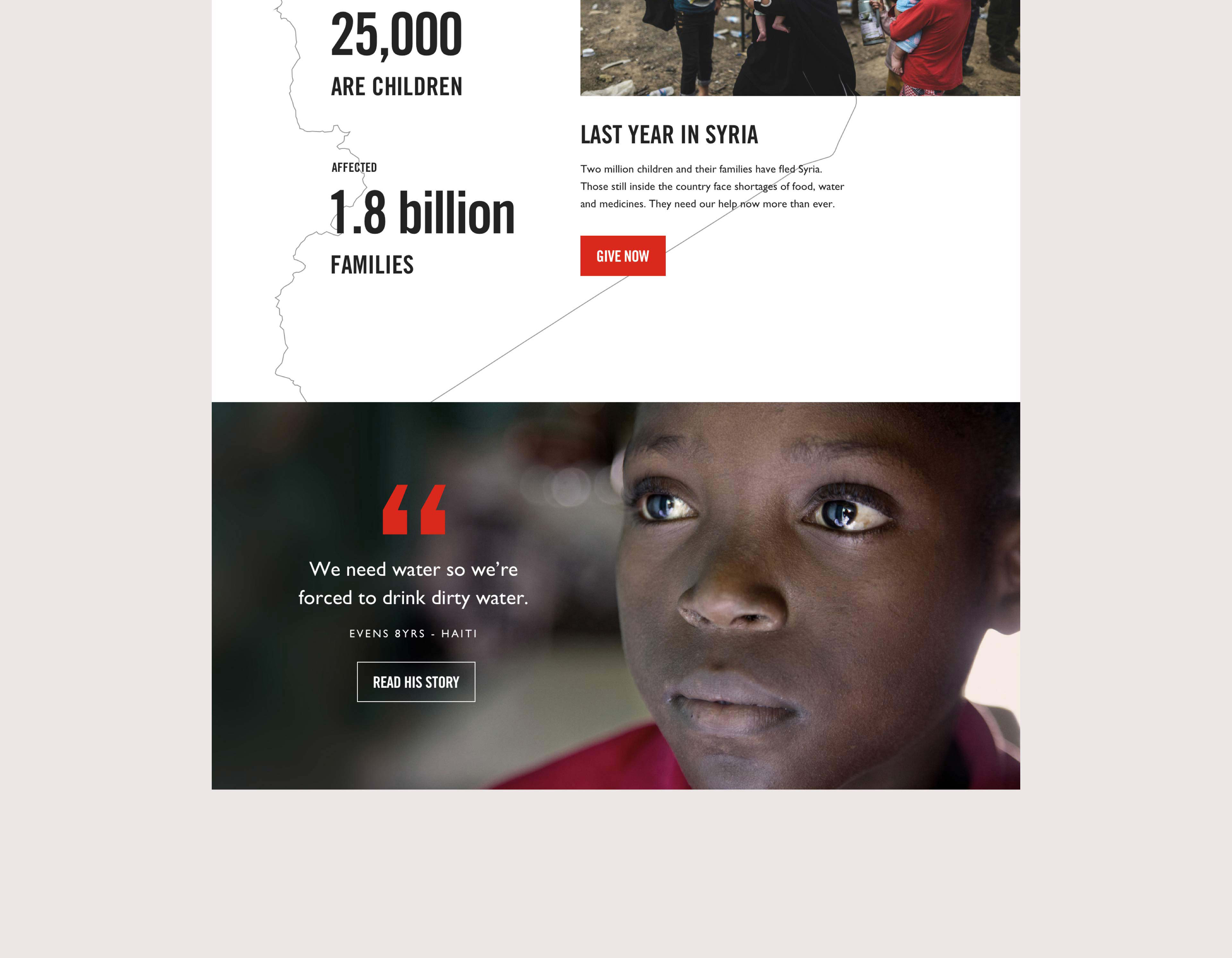
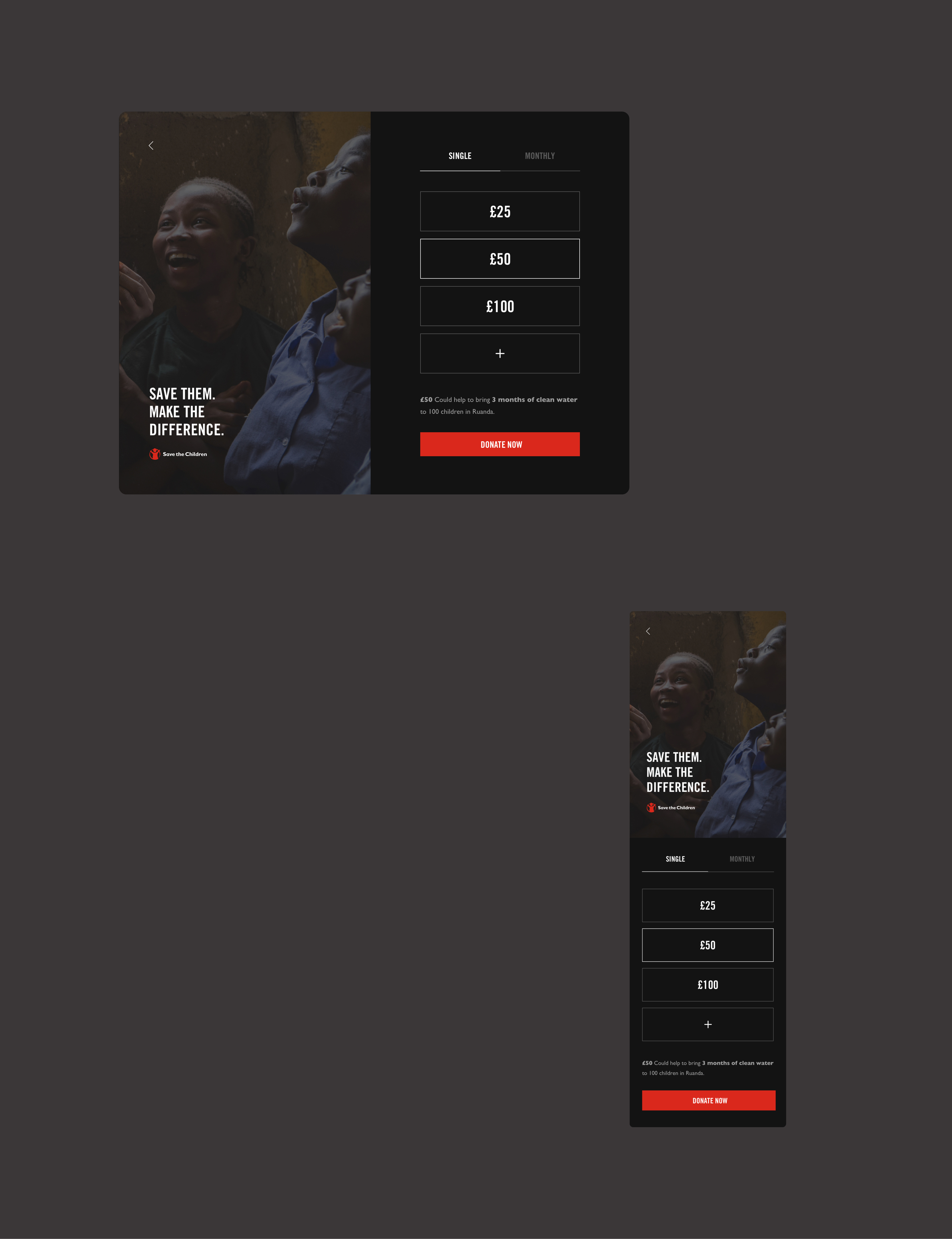
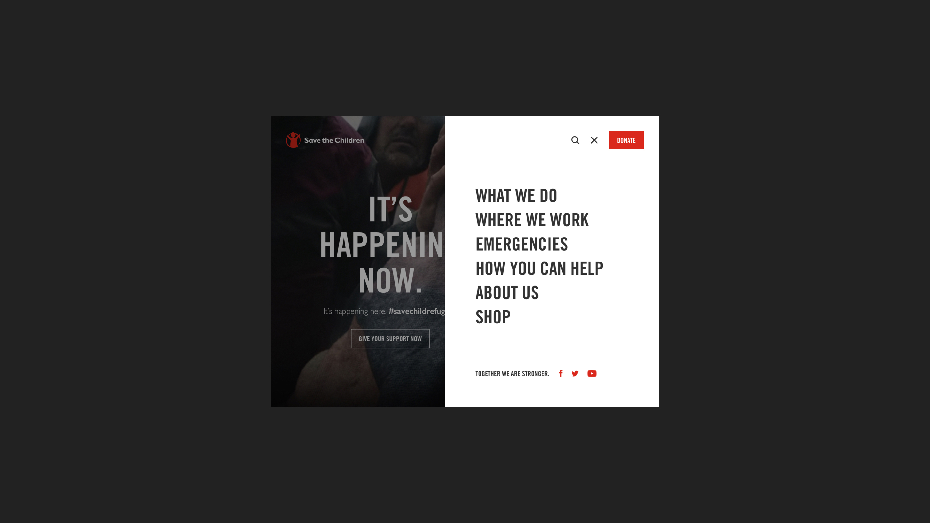
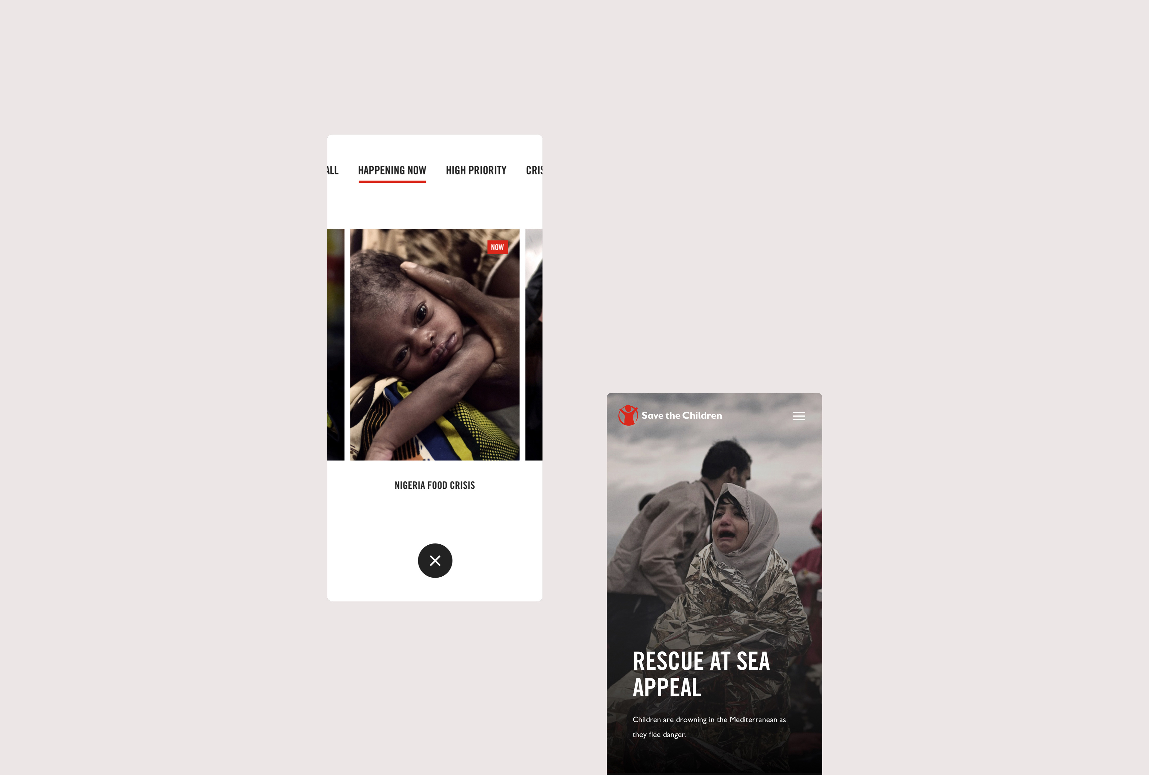
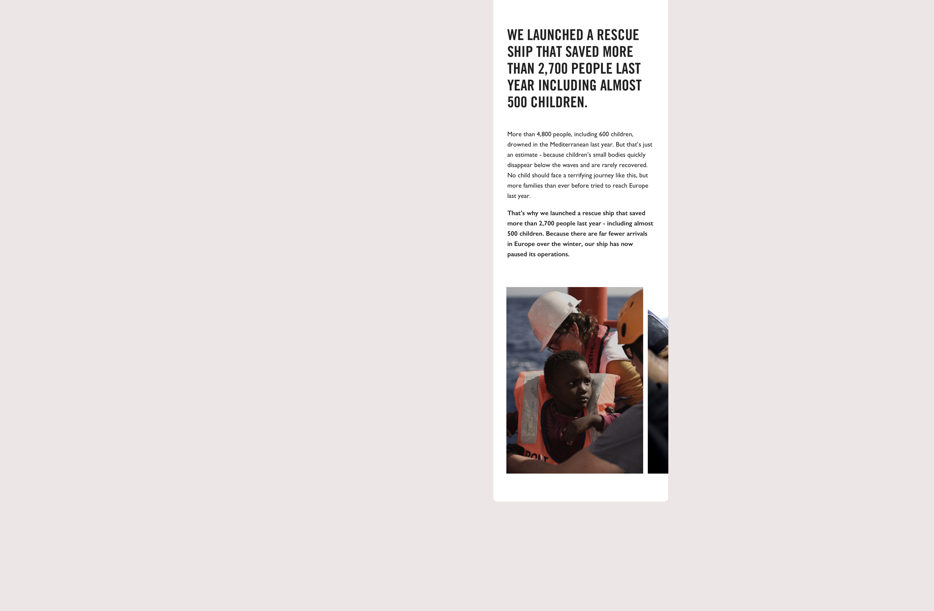
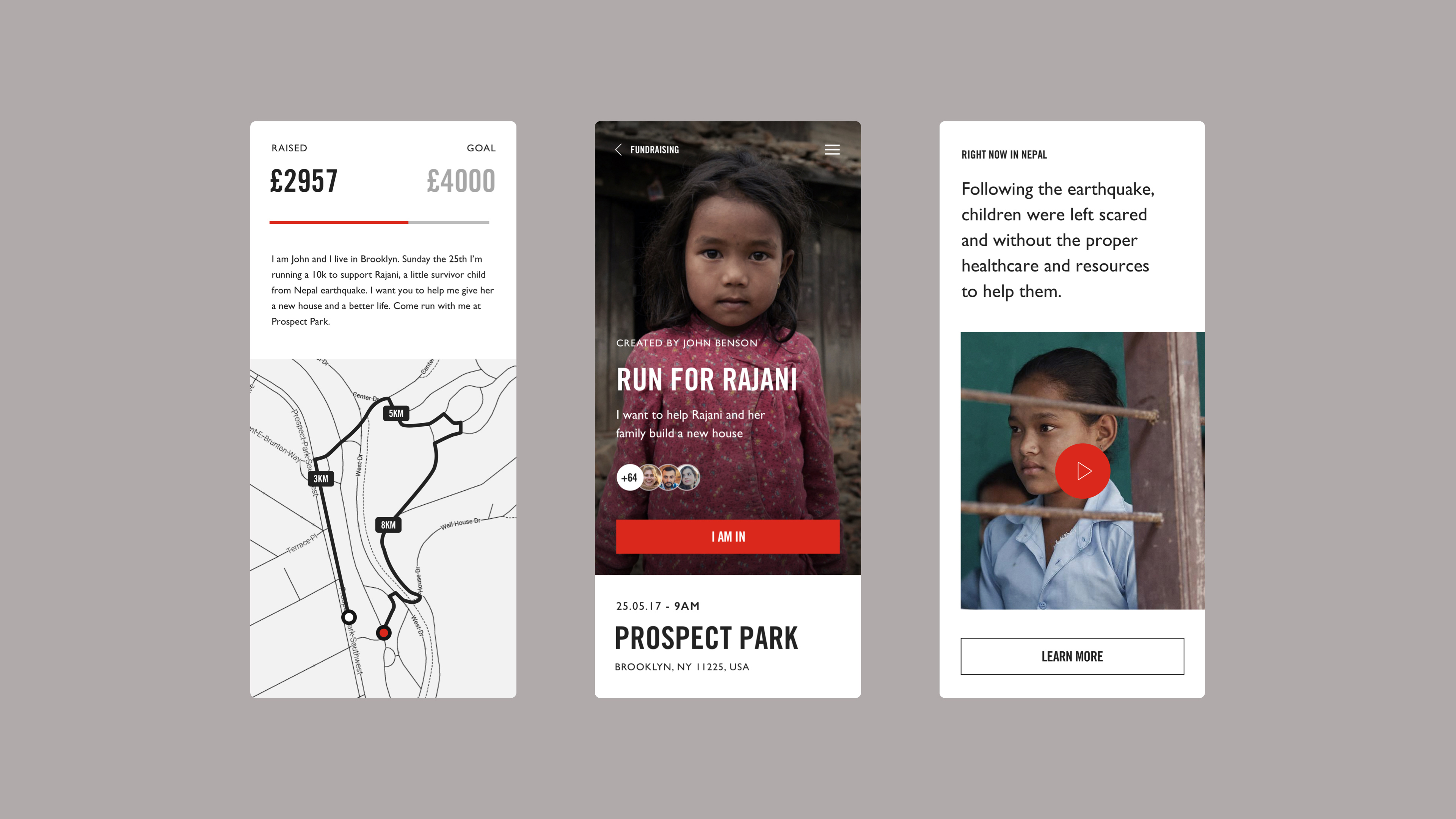
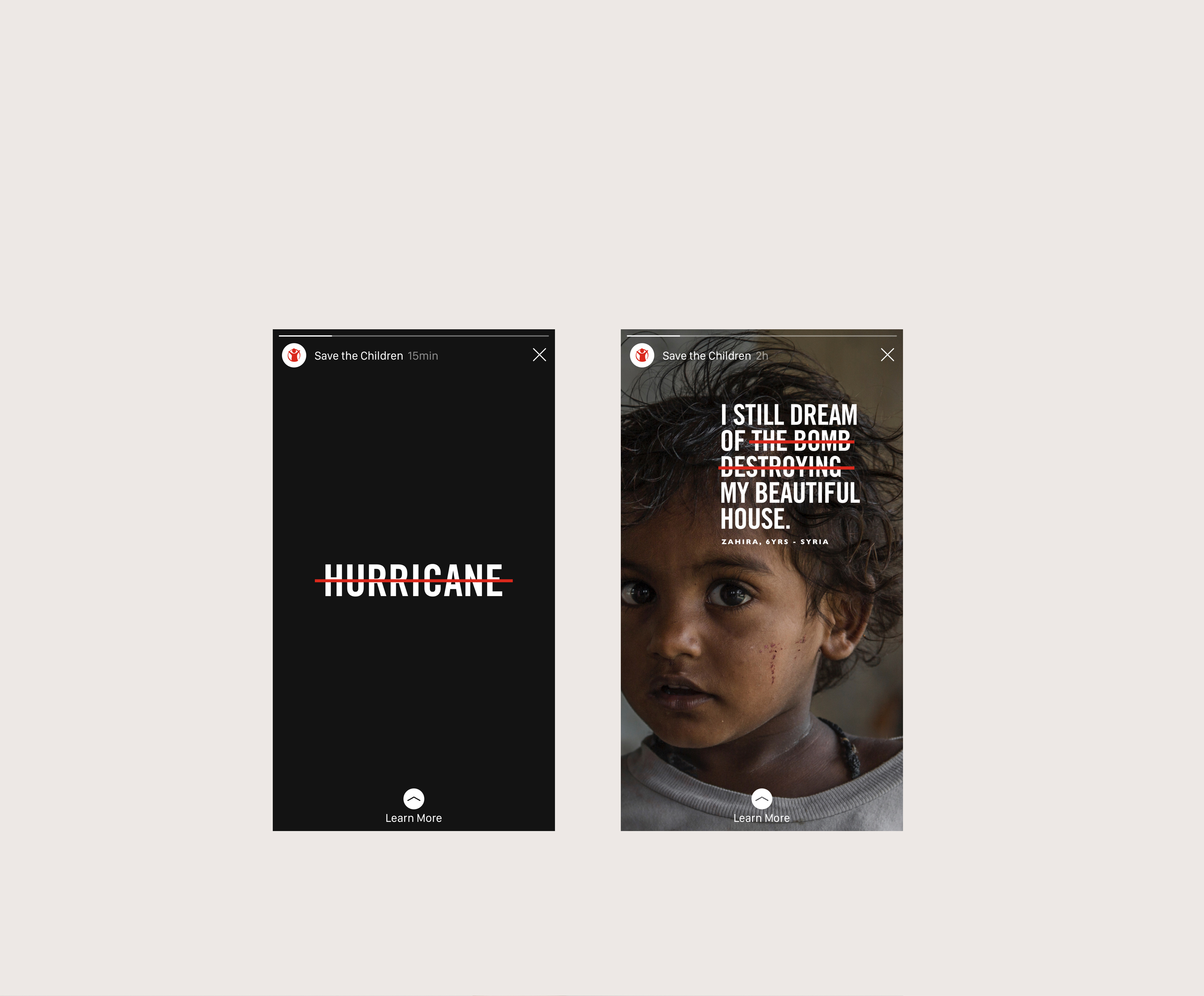
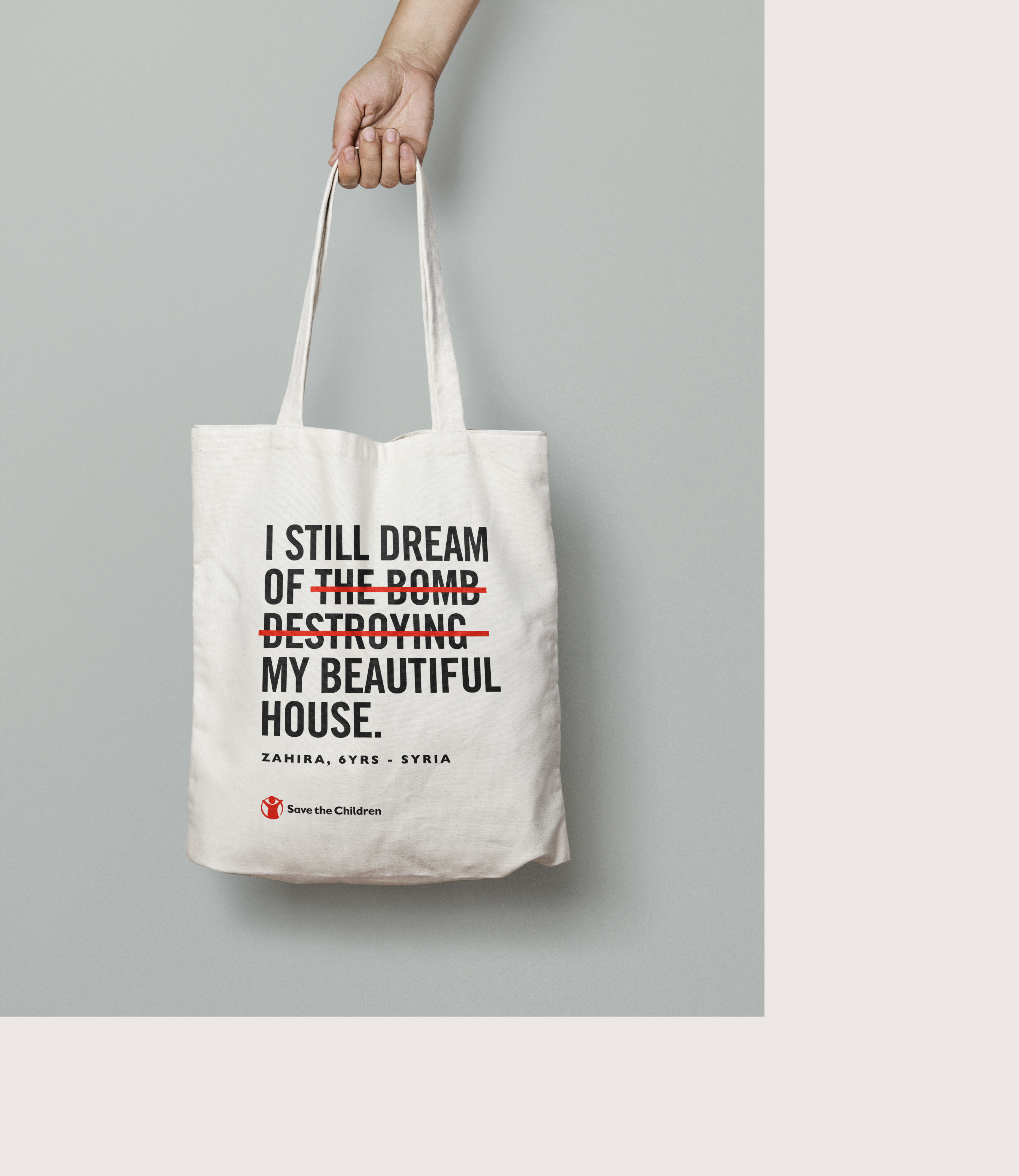
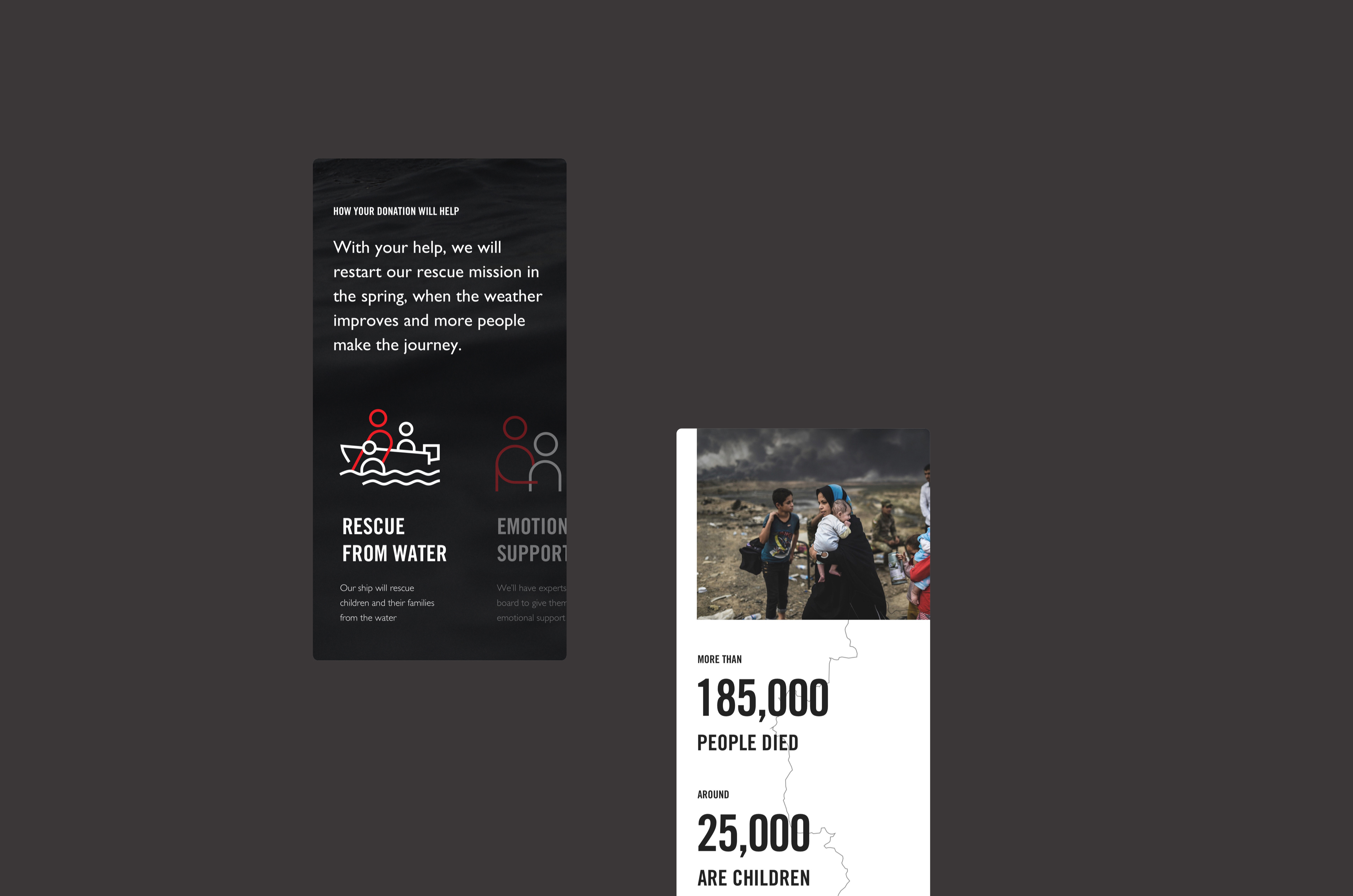
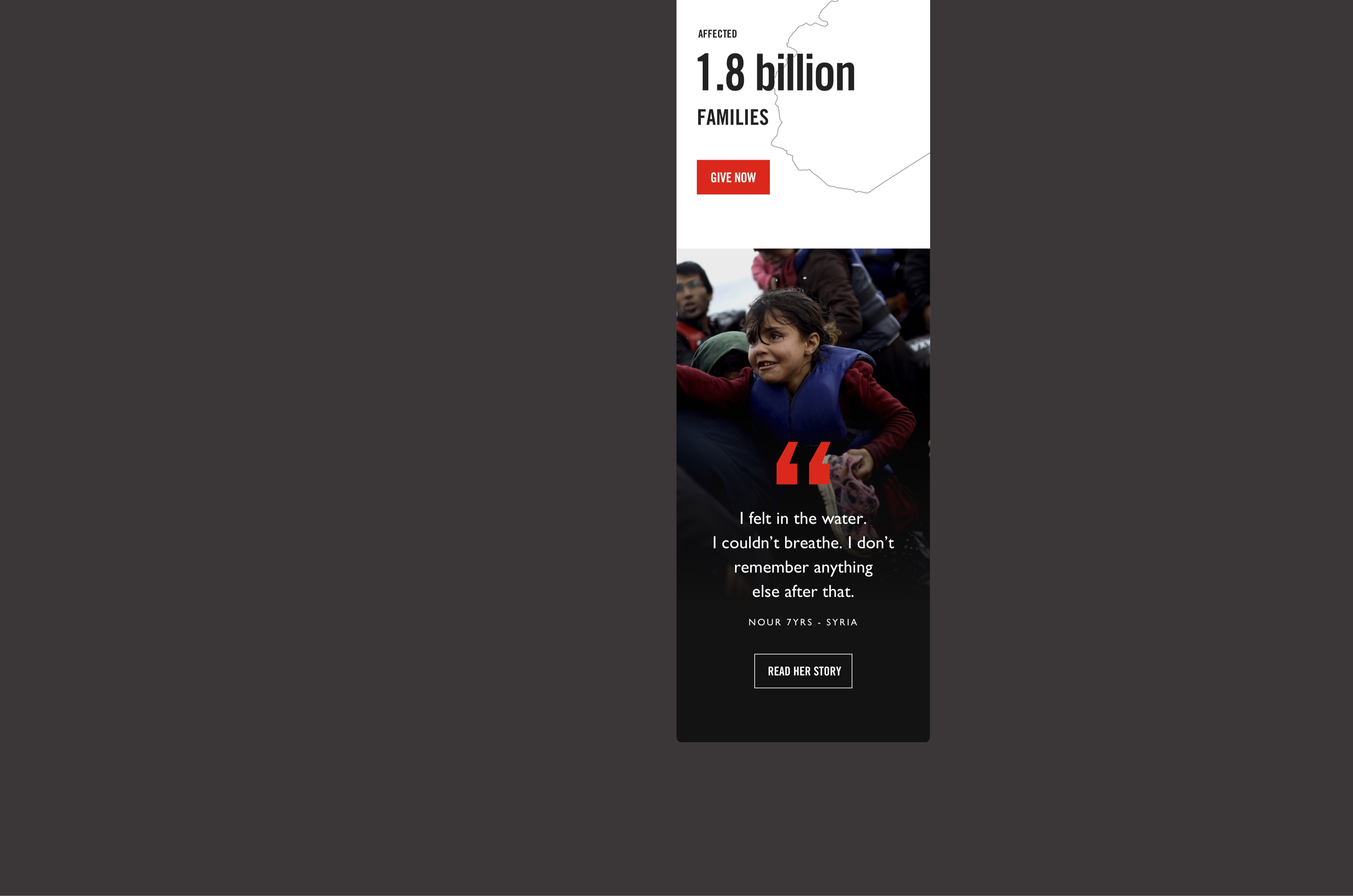
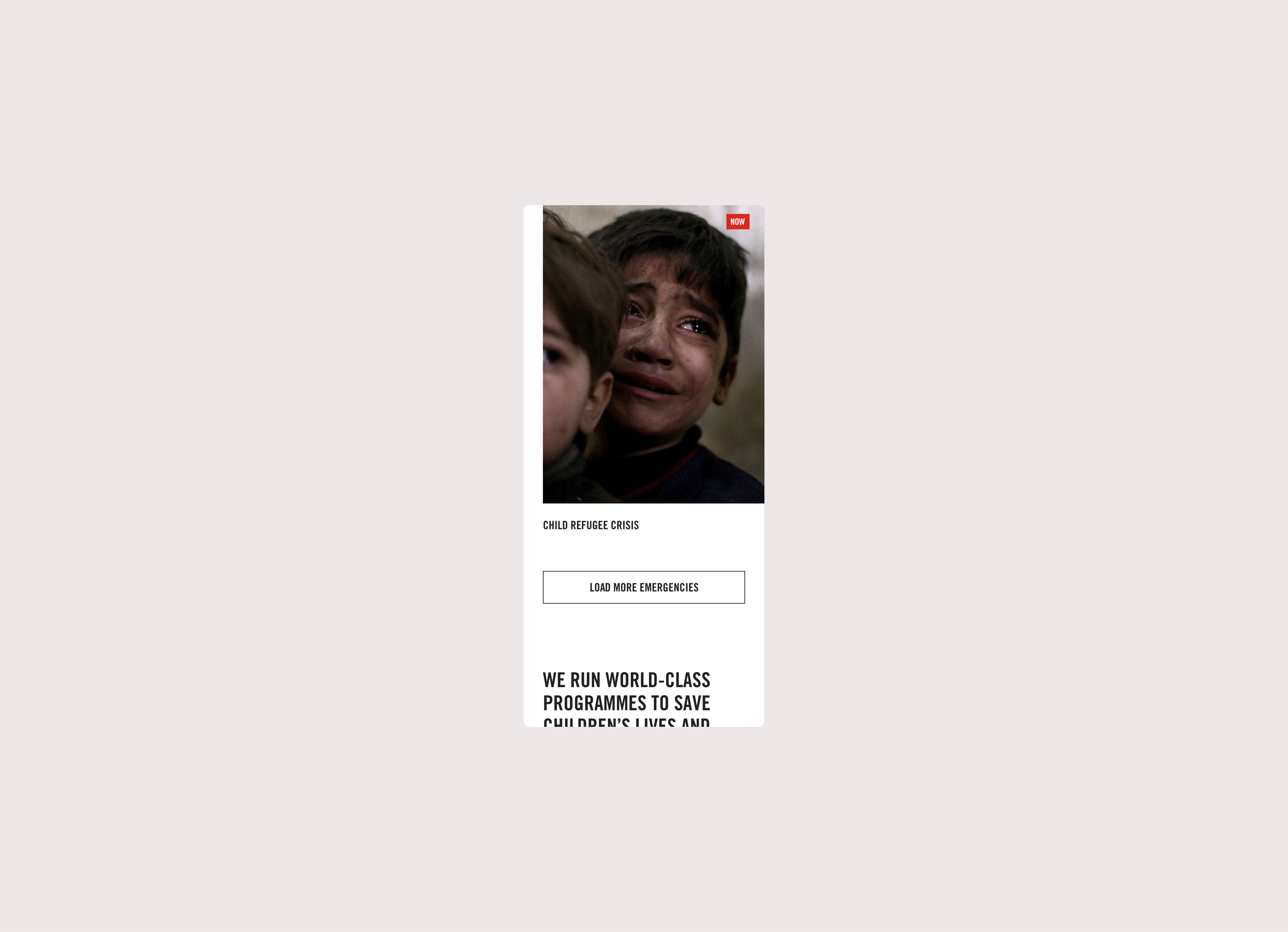
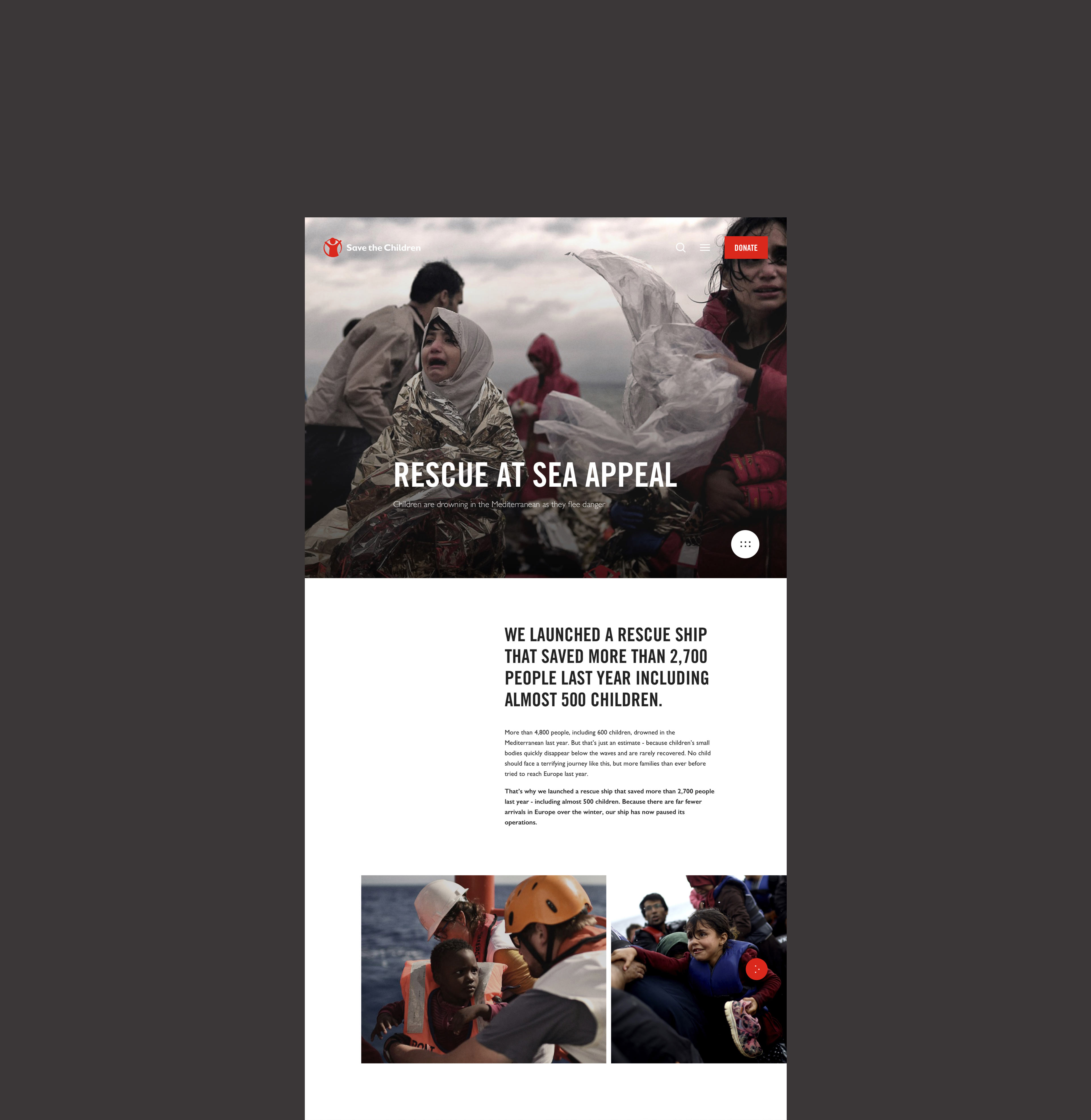
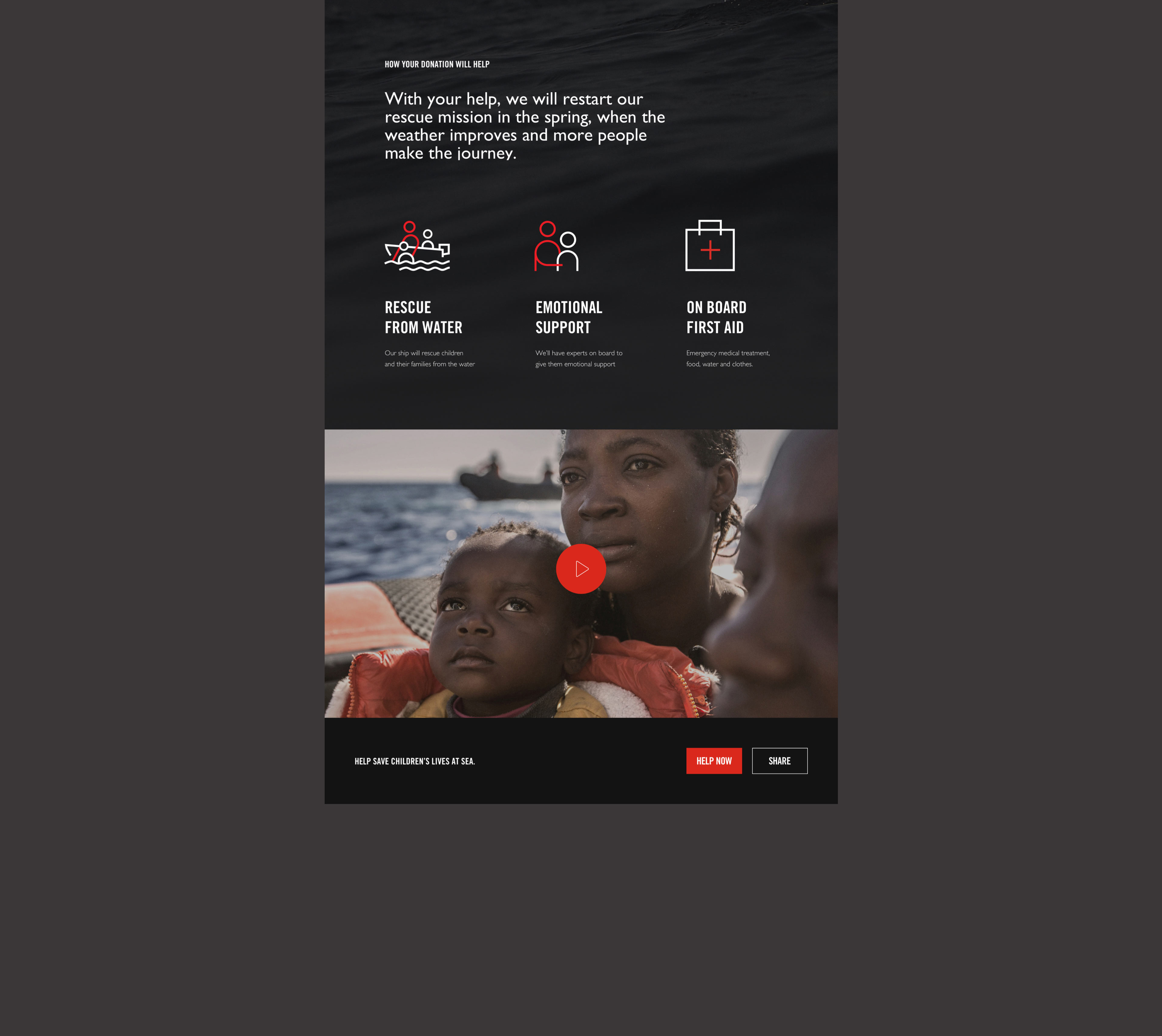
The visual identity was thoughtfully crafted to convey a profound sense of truth and urgency, achieved through clarity and accessibility. The language employed drew inspiration from the graphic style of newspapers, mirroring the realness of the stories. The digital experience was thoughtfully designed to provide users with meaningful context surrounding real-life emergencies worldwide and to empower them with actionable ways to support urgent appeals.
Credits
Creative director
George Freitas
Art direction & UI
Daniele Signoriello, Yingshun Wong
Agency
Publicis.Sapient


Next project
